A Typographer's Letter to Brad Bird
Matthew Butterick, the typographer and writer behind Typography for Lawyers, took issue with the use of the Verdana typeface in Brad Bird’s Mission: Impossible - Ghost Protocol, so he wrote the director a letter.
{% blockquote -Matthew Butterick, Typographer http://mbtype.com/pdf/bird-verdana.pdf Letter to Brad Bird, January 20, 2012 (PDF) %} Inapt typography is not uncommon in movies. But big-budget studio films employ scores of people specifically to worry about the details that ensure the on-screen experience will be seamless. Therefore, it’s incongruous to put all that care (and money!) into the frame and then overlay it with an inapt font, which in its own small way, breaks the illusion. It’s not Mission: Impossible — IKEA Protocol, is it. {% endblockquote %}
I had a similar reaction when the text showed up on screen, but I forgot all about it once I nearly lost my lunch during the Burj Khalifa scenes. This whole letter is gold.
UPDATE 01/25/12: Brad Bird Responds to Typographer
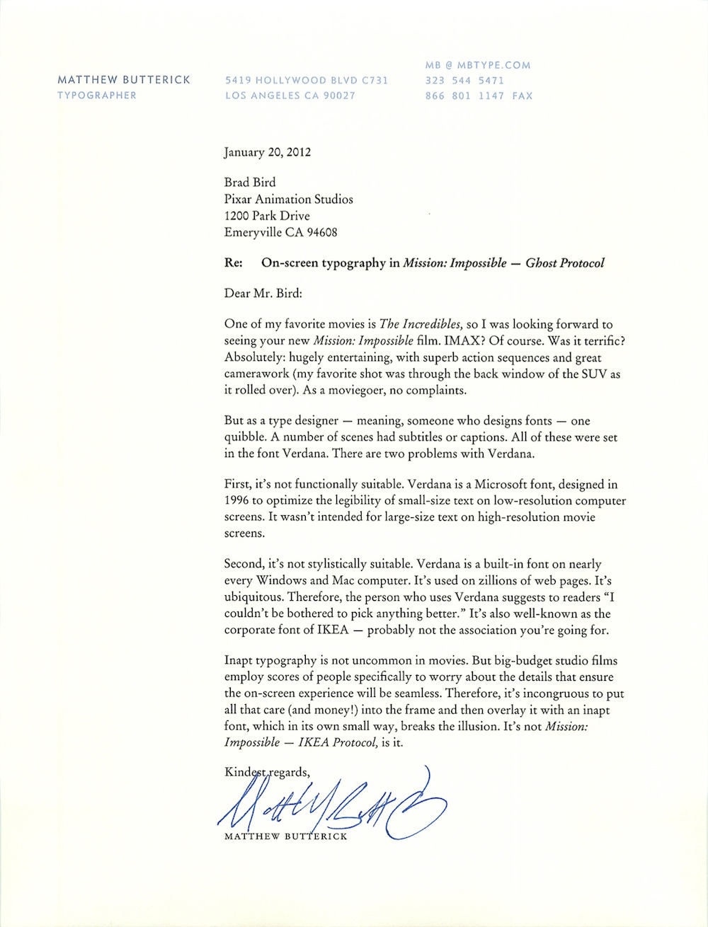
Letter to Brad Bird, January 20, 2012
(via Shawn Blanc.)