The Strange Fate of Kim's Video ⇒
Karina Longworth gets investigative for The Village Voice:
The closing of a video store is not news. With Web streaming, the vanishing DVD sales market, and Netflix, it’s an inevitability. Usually, the fate of the physical videos after the store’s closing isn’t news, either. Maybe there’s a dollar sale. Maybe employees smuggle home the dead stock. The customers adapt. They find another video store. They use BitTorrent and YouPorn.
This is how it happens. If you’ve ever had a video-store membership, this has probably happened to you.
This is not how it happened with Mondo Kim’s.
Spending hours wandering Kim’s was one of my favorite things to do in NYC even before I lived there. I was sad to see it go, but I thought it was just the way of things. There’s more to it, though. Longworth travels to Salemi, Italy to find out what happened to one of the greatest video collections on the planet.
Google Launches Native YouTube iPhone App ⇒
The new app is built by YouTube engineers, to give our iPhone and iPod touch users the best mobile experience.
Apple’s original iPhone native YouTube app was revolutionary. Remember: YouTube switched to H.264 video to accommodate streaming video to the Flash-less iPhone. But it’s well past its prime and YouTube’s mobile site has some limitations. Glad to see Google is keeping its iOS offerings fresh.
Which Courier is the Best Courier?
Since I’m playing with Fountain again, it brought up a question I tried to avoid back when I was working on Fountain for Marked: which version of Courier is the correct one? Before I get into this I should tell you that the correct answer is “whichever one you like.” I’ve written before that the aging rules of screenplay formatting are a hindrance in our digital age, but hey, if you can’t beat ’em, join ’em.1
In tweaking Fountain for Sublime Text, I had the opportunity to set the default font when opening a .fountain document. Users can override this, and in fact part of the fun of Fountain, in my opinion, is in not being locked to a single font as you are when you use that expensive app that rhymes with “Primal Shaft.” However, since the Courier font is so tied to screenwriting, I thought it would be a good reminder that you’re working on a Fountain document.2
If there were only one version of Courier (see: Wikipedia) it would be simple. But there aren’t. Here are the four I keep on my system are as follows:
- Courier (System)
- Courier New (System)
- Courier Final Draft
- Courier Screenplay
For a great read on Courier, I recommend Roland Stroud’s “Everything You Ever Wanted to Know About Courier . . . And Then Some” (PDF). He goes deep into how the font works, including this interesting tid-bit:
The real criterion is not the name of the font, but its look. Is it a bearded, monospaced font that you can print at 12 points? Does it have the same general look as Courier fonts? Does it look crisp and neat? If the answer is yes to these questions, then you can use it.
For the purposes of editing a screenplay in Sublime Text, most of this doesn’t matter as you should never print directly from the app. We have Highland and Textplay and Screenplain for the that. That said, I still kinda like aping the printed page look in my editor. So let’s look at some versions of Courier.
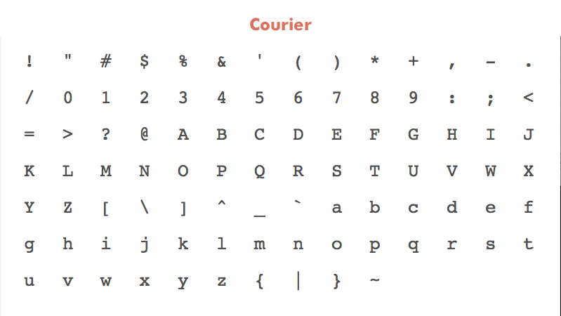
Courier Specimen
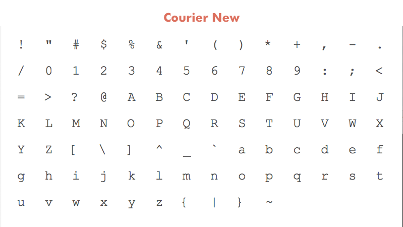
Courier New Specimen
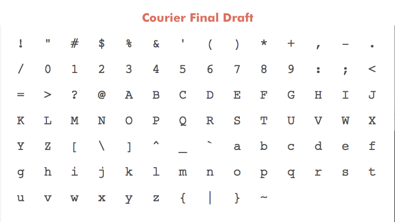
Courier Final Draft Specimen
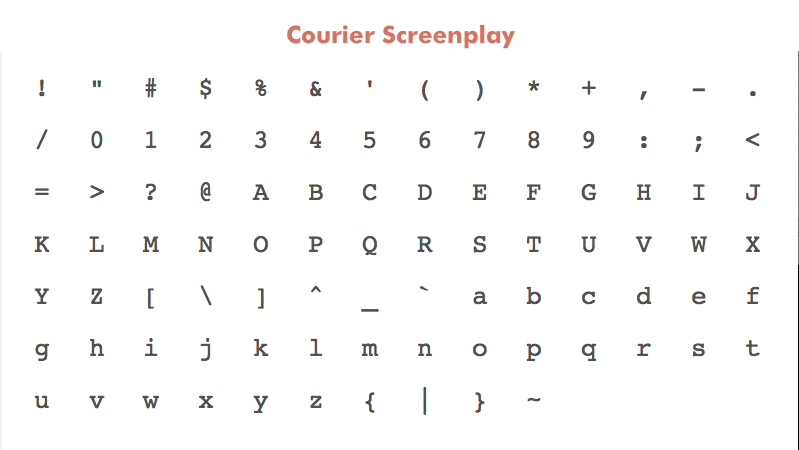
Courier Screenplay Specimen
(Note on methods: the above character palettes and below closeups are screen grabs from Fontcase. As such the resulting .png files were generated at 72dpi. As such they likely won’t render crisp on retina displays. The last image below of body samples, however, was generated at 300dpi. These images are meant merely to be illustrative.)
The main recognizable difference is that “Courier New” is significantly thinner than the rest. I laid the fonts over one another the find other glaring differences, but the truth is that, save for a few items like “Courier Final Draft’s” more modern ampersand or “Courier’s” titled octothorpe, they are all quite similar.
In order to get a closer look, I blew up the lowercase m glyph for each font and placed them next to one another:
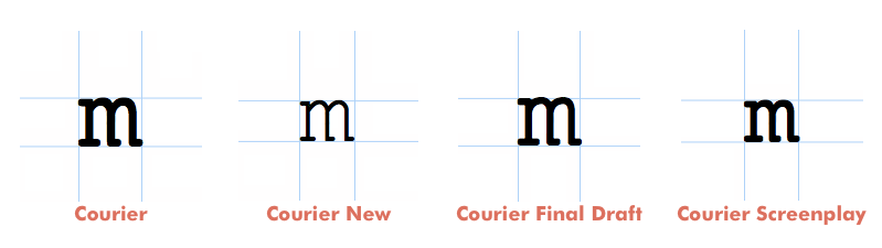
Courier m Glyphs
The thinness of “Courier New” becomes more pronounced when you look at it up close. “Courier Final Draft” appears to be a slightly shaved down (or molded, really) version of “Courier” while “Courier Screenplay” is more squat. Of course, that’s only looking at a single glyph.
Here is a classic excerpt from Lawrence Kasdan’s script for Raiders of the Lost Ark3 set in all four fonts at 12 point. The width, accordingly, is set around 432 point (I think I added a point or two), or the equivalent of six inches on a printed page, the amount allotted to action blocks in screenplay formatting.
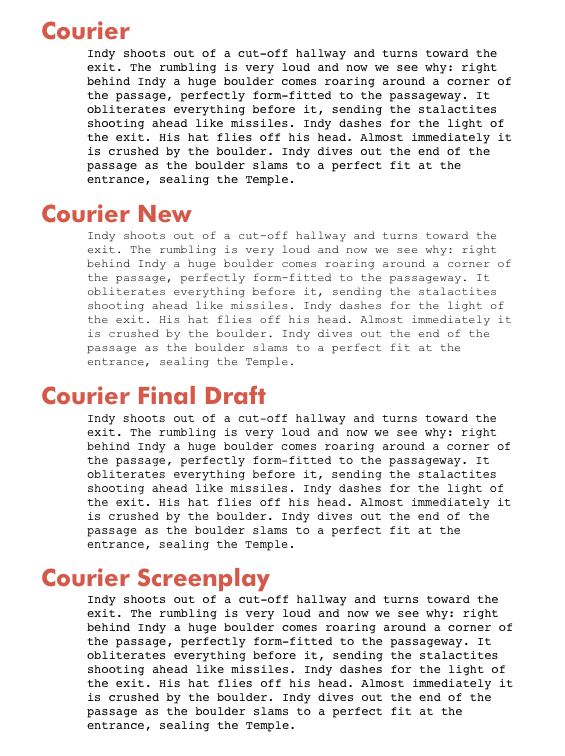
Courier Body Samples
As you can see, Roland Stroud’s rule of thumb holds true. Each paragraph looks identical on a macro level. The ragged right edge matches the copy of the printed Raiders script I have exactly, so if we’re looking for simulacrum, any of these fonts will suffice.
“Courier New” looks almost unreadable on my screen. While it may look crisp on a printed page, it’s too thin to use in a text editor. To my eye, “Courier” and “Courier Screenplay” look much stronger at 12 point than “Courier Final Draft.” However, the fonts render with slightly different heights. It’s not so apparent here on an image, but if you switch back and forth between the fonts in Sublime Text (or any editor) you’ll start to see the difference.
For me, Courier Screenplay looks the best when editing within Sublime Text, so it’s what I’m going to use when working on scripts (until I change my mind).
As for the defaults in the Sublime Text package, I changed the default font to “Courier” since it’s a system font that all users will be able to load without conflict. Additionally, “Courier” has the most extensive set of glyphs of any of the fonts in question, so non-English writers will want to stick with it.
I’m removing “Courier New” as a pre-set option in Fountain for Sublime Text. Users can easily add it back in, but I think it’s just taking up space in the .sublime-settings file.
“Courier Screenplay” will be the second choice font for users to rely on and the “Courier Final Draft” will remain below it. I wish that Sublime Text supported fallback fonts the way CSS does, but since it doesn’t users will have to manually change the font of choice in the app. Shouldn’t be too hard for screenwriting nerds, though.
One more nerdy change. In the aforementioned Courier piece, Roland Stroud shares this:
The distinguishing feature of a typewriter font was not its typeface, but its pitch, which is the number of characters it makes per inch. […] Two pitches were available: standard 12-point pica, which measured out to 10 characters per inch; and 10-point elite, which measured out to 12 characters per inch.
Since 12-point is the screenplay standard, I’ll take Stroud’s measurement of ten characters per inch and multiply it by our six-inches of action slug on a traditional screenplay page: sixty characters per line. The Fountain package specifies the width of the text column in characters (and moves it to the center).
The text column width is now set by default to sixty-one characters (sixty didn’t look right) which lines up nicely with a printed screenplay. The Raiders excerpt, for example, looks identical in Sublime Text as it does on a printed page. Since this width is in characters, you are free to change the font size, or font for that matter, and the column should grow accordingly.
Okay, I think that’s enough on Courier for one day. Back to writing, maybe.
-
The rules of screenplay formatting work because of the 1 page=1 minute rule but, come on, we’ve got supercomputers and such; can’t we come up with a way to count approximate screen time without relying on words stuffed in a 8.5x11" rectangle? ↩︎
-
While we’re on the subject, if anyone wants to let me know how Pitch looks in Sublime Text (or wants to gift me a license) I’m quite curious. ↩︎
-
The opening sequence of Raiders is a shining example of “show, don’t tell” screenwriting. It’s almost all long action blocks (a screenwriting class no-no) and just as thrilling a read as wathing the actual film. ↩︎
“Part of a Much Larger Transformation” ⇒
Manohla Dargis, in conversation with A.O. Scott, on the transition from film to digital:
We’re not talking about the disappearance of one material — oil, watercolor, acrylic or gouache — we’re talking about deep ontological and phenomenological shifts that are transforming a medium. You can create a picture with oil paint or watercolor. For most of their history, by contrast, movies were only made from photographic film strips (originally celluloid) that mechanically ran through a camera, were chemically processed and made into film prints that were projected in theaters in front of audiences solely at the discretion of the distributors (and exhibitors). With cameras and projectors the flexible filmstrip was one foundation of modern cinema: it is part of what turned photograph images into moving photographic images. Over the past decade digital technologies have changed how movies are produced, distributed and consumed; the end of film stock is just one part of a much larger transformation.
This conversation has been going on for fifteen years or so, really since Dogme 95, with the main difference now being that we have hindsight to inform us what happens when we let Hollywood’s bottom line drive out legacy technologies. Still, it’s nice to see The New York Times letting their talented co-chief critics loose on the digital transition. These little back-and-forths have provided some of their best writing and most distilled arguments.
Instapaper Unblocks 9to5Mac ⇒
Yesterday folks started noticing that 9to5Mac, an Apple news clearinghouse with a reputation for dubious posts, couldn’t be saved to Instapaper with the service’s Bookmarklet. Today, Matt Buchanan at BuzzFeed got the full story from Marco Arment, the maker of Instapaper:
Even though the original error message implied 9to5Mac had requested the block, Arment later confirmed on Twitter he proactively blocked 9to5Mac because he believes it “objects” to Instapaper, and that what it’s published about Instapaper is potentially libelous…
This post was originally a critical reaction to Marco’s stance, that those who libel his company shouldn’t get to be on it. I knew that Marco would eventually blog about this himself and shed some light on the situation, but no explanation short of reversing the block and apoligizing seemed acceptable.
I’ve now reversed that decision, and I’m sorry that I overreacted.
No company, not even a small one, not even one with a (sometimes) likable personality at its helm, should get to tell us what we can read on the Internet. The idea that any part of the open Web could be blacked out at the whim of one person should be ominous.
Imagine if Google had removed The New York Times from search results due to coverage it didn’t agree with.1 I’m sure the Marco would not stand for that, so I’m glad he saw his error and corrected it.
However, these mistakes will happen. It’s how companies deal with them that matters, and Marco righted this one quickly. I doubt it will happen again.
-
I know this is a terrible analogy. 9to5Mac is no New York Times and the coverage in question turned out to be bogus and harmful. But data is data. ↩︎
Introducing Fountain for Sublime Text
Update November 26, 2012: Fountain for Sublime Text Gets New Themes, Package Control and More - The latest and greatest awaits.
Preamble
You remember Fountain, the plain text screenwriting syntax, don’t you? Of course you do. Quick refresher:
Fountain is a simple markup syntax for writing, editing and sharing screenplays in plain, human-readable text. Fountain allows you to work on your screenplay anywhere, on any computer or tablet, using any software that edits text files.
It’s been a year and a month since Stu Maschwitz’s original Screenplay Markdown proposal that set off the great plain text screenwriting craze of 2011-2012. Fountain is now supported by a growing list of apps, including on iOS and Android.
I played my part with Fountain for Marked1, which allows you to preview your Fountain screenplays in Marked. To date Fountain for Marked has been downloaded nearly 600 times, which seems like a lot given the niche crowd: nerdy screenwriters with Macs who also own Marked and aren’t afraid to mess with their ~/Library directory.
Anyway, let me introduce you to a new member of the Fountain family, Fountain for Sublime Text.
Some Backstory
One of the most important tools for understanding any syntax, in my opinion, is syntax highlighting. Here’s Wikipedia:
Syntax highlighting is a feature of some text editors that display text—–especially source code—–in different colors and fonts according to the category of terms. This feature eases writing in a structured language such as a programming language or a markup language as both structures and syntax errors are visually distinct.
A screenplay and its many parts are not so unlike any other kind of code. And so I have been drawn to using code editors for working with Fountain.
The now deprecated Screenbundle was, for a time, my favorite option for writing plain text screenplays in TextMate. It offered robust syntax highlighting and text re-formatting, but it relied on a custom syntax. A while ago I tried to modify Screenbundle to work with Fountain within TextMate, but it proved more difficult than I could handle at the time.
I recently went searching for a way to get Fountain working in Sublime Text 2, which I’ve been using lately. I found this forum post from Sublime Text user “nick.” He coded the basis for a .tmlanguage file, which is what tells the app how to highlight different elements. It was a start, so I installed it and started messing around.
As I dove into “nick’s” .tmlaguage file, I started finding small things I could fix. I added some code I found in Sublime Text’s plain text parser that tells the app to wrap to words instead of characters and added the lowercase versions of slug indicators (int., ext., i/e) so that writers can type sluglines however they prefer.
I really like (and use) Brett Terpstra’s MarkdownEditing package for Sublime Text. I basically borrowed its structure (thanks, Brett) to customize the way Fountain files look when loaded. I cobbled these disparate strands together and uploaded them to GitHub. You can go and play with the package right now, or fork it and fill in the significant gaps that I have left.
Installation & Download
- Download and unzip the current version.
- Rename folder to
Fountainand move to~/Library/Application Support/Sublime Text 2/Packages. - Restart Sublime Text 2.
- Write the next Chinatown.
Notes
- Feel free to delete the
imgfolder andREADME.mdonce you’re up and running. - Alternatively, you could clone the GitHub repo to the same location listed above. If you’re new to Git, I recommend “git - the simple guide.”
What Does it Do?
Fountain for Sublime Text adds syntax highlighting when editing .fountain documents. Currently supported highlight elements:
- Title Page
- Scene Headings
- Characters
- Parentheticals
- Transitions
Note that Fountain.tmlanguage supports more of the syntax, but Fountain Classic.tmTheme only calls on the elements listed above using their custom scopes.
What’s in the Box?
Fountain.tmlanguage- Grammar and syntax for Fountain.Fountain Classic.tmTheme- Basic theme using colors from the “Mac Theme.”- Note: The syntax currently uses custom scopes, which means themes will need to be edited to account for these new scopes. This theme incorporates only the custom scopes.
Fountain.sublime-settings- All of the customizations live here. Start here if you want to make any changes.Title Page.sublime-snippet- Snippet for Fountain title page formatting.- Type ⌘⇧P then search for “Snippet: Title Page” and hit
return. You cantabthrough lines as you fill in your information.
- Type ⌘⇧P then search for “Snippet: Title Page” and hit
Save the Cat.sublime-snippet- Snippet that loads the Save the Cat beat sheet as detailed by Stu Maschwitz in this post.- Type ⌘⇧P then search for “Snippet: Save the Cat” and hit
return. The outline will appear as Markdown headers.
- Type ⌘⇧P then search for “Snippet: Save the Cat” and hit
Customizations
The Fountain.sublime-settings files contains a number of customizations to make Sublime Text 2 a bit more writer friendly. To customize to your liking, such as changing the font used for Fountain editing, simply open this file and edit.
Here’s what it looks like (with explanations for most):
{
    "extensions":
    [
    "fountain"  // Indicates will only load for .fountain files
    ],
    "font_face": "Courier Final Draft", // Defaults to "Courier Final Draft" Comment (//) this line to switch to defaut font
    // "font_face": "Courier New", // Uncomment to switch to "Courier New"
    // "font_face": "Courier", // Same here. Customize with different Font by placing fontname in quotes.
    "font_size": 15,
    "color_scheme": "Packages/Fountain/Fountain Classic.tmTheme",
    "word_wrap": true,
    "wrap_width": 70,  // "Page" width. Delete and text will wrap to the whole window.
    "line_padding_top": 5, // Just adds some breathing room for text.
    "draw_centered": true, // Delete if you'd prefer your text to lock to the left.
    "indent_subsequent_lines": false,
    "trim_automatic_white_space": true,
    "line_numbers": false, // Change to true to see line numbers again
    "translate_tabs_to_spaces": true // Turns tabs to spaces to keep highlighting working on indented lines.
What Doesn’t Work?
- Tab indentations
- Tab indents will not trigger the syntax highlighting.
- Space indents work fine, and
Fountain.sublime-settingscontains a line that turns tabs to spaces. - You can try this plugin to convert tabs to spaces on save for legacy scripts.
- This has no effect when converting your document with other software, such as Highland.
- Non-Screenplay Elements
- Outlining, notes, synopses, etc. are not currently fully supported in the syntax highlighting.
Help, Please
I will continue fiddling with this project, but if you know what’s causing some of the current problems or ways to make this load cleaner, I’d appreciate it very much. Specifically, I’d like this to work with any color scheme, not customized ones. Also, if character and scene completions could be implemented, this would be a much better solution for nerdy screenwriters.
What’s it Look Like?
Basically like this:
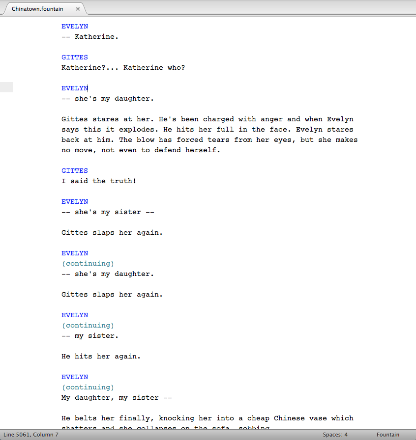
Fountain for Sublime Text Screenshot
-
Stu, Martin Vilcans and Brett Terpstra deserve a lot of the credit for that. ↩︎
Staying Friendly ⇒
Marco Arment on coverage of the HP Spectre One at The Verge and Engadget:
Big “gadget” blogs depend on maintaining very friendly relationships with the companies whose products they cover so they can continue to get exclusives, interviews, press badges to events, and early access to products. Maintaining these relationships while retaining credibility isn’t always an easy choice for many sites, and many choose poorly.
Even when they do get exclusives and interviews, there’s not much to them.
See also: the Harry Marks piece Marco links to.
Topolsky Bites Back ⇒
Joshua Topolsky, Editor-in-Chief of The Verge, responding to the aforelinked criticism of his site:
…Just as I felt compelled to respond to Michael Arrington when he attacked the work I (and my team) did at Engadget, I am now responding to Marco Arment, John Gruber, and anyone else who sets up a minimal Wordpress blog and thinks that the ability to publish text onto the internet gives them insight into what journalism is or what I do for a living.
First of all, Joshua, what the hell? Didn’t you read my post? I don’t have a minimal Wordpress blog1 so…we’re cool?
I get Topolsky’s knee-jerk reaction in publishing this post, though for the life of me I don’t understand why he took to his personal blog and not The Verge’s forums, let alone publishing an editorial comment on Verge proper.2 He has been hurt by two of the tech community’s heaviest hitters, so he’s upset or trying to rally his troops or whatever.
But let’s enter Topolsky’s universe for a second.
Without going down a rabbit hole of he-said she-said, Marco and Gruber are just basically wrong. We of course mention this kind of thing all the time in our writing. Like here, and here, for instance — in reviews especially, where that kind of critique is actually useful. Here’s our senior editor Paul Miller talking about it in 2009. You guys getting this over there? Welcome to three years ago.
Ever since I published my explanation of why I’m done with The Verge and read reactions from others, I’ve been trying to understand what it is that makes Topolsky’s site what it is. This paragraph gets to the heart of why I think people like Arment, Gruber, Ben Brooks and myself have so much trouble reading them.
Here goes: The Verge, it seems, is primarily aimed at people who read The Verge. You think they don’t mention Apple? They did! Two months ago! Eight months ago too! Listen to The Vergecast. Read the rest of the site. Everything is there.
Take the case of Bryan Bishop’s missing disclosure of his relationship to Rian Johnson, the director of Looper, in his review of that film.3 That he should add the disclosure was pointed out by a reader named “slipslip” who also read Bishop’s interview with director Rian Johnson. To which I said:
On what planet is disclosure a suggestion?
On planet Verge.
I’m not being funny here. Rather I think this mindset is endemic to what Topolsky and company have built.
In Bishop’s mind and the minds of every Verge employee, I’ll bet, the disclosure wasn’t necessary because readers could do the footwork themselves, as reader “slipslip” did, and figure out that Johnson went to school with Bishop. From their point of view, they never obfuscated their relationship; it’s right there on another page. Don’t you read The Verge?
I don’t. Not anymore.
-
Neither do Gruber or Arment, for that matter. Not the point, but, Josh, if you want to be that patronizing can’t I play too? Do you know how much of a dick that makes you sound? “Your opinion is invalid because you’re not me” is not a defense. ↩︎
-
It really is tough keeping up with how many versions of The Verge there are. ↩︎
-
I cover this in greater detail in my post from last week. ↩︎
Don't Ship Pot to a Movie Studio ⇒
Helen Freund for The New York Post:
Police said members of the 114th Precinct Anti-Crime unit responded to Kaufman Studios on 36th Avenue in Queens on Sep. 6 after the building’s security personnel intercepted two big cardboard boxes stuffed to the brim with pot. The boxes contained nine sealed plastic pouches of marijuana guessed to weigh around 10 pounds in total.
The intended recipient of the pot-filled parcels, Brooklyn resident Lowell Schulman, 53, admitted to cops that he had been awaiting the drugs but that he had been expecting a much lighter load.
Kaufman is where they film Sesame Street and many other major NYC productions. Pro-tip: send your big box of weed somewhere else.
(via Gothamist.)
So Steve Streza Made a Mashup, And Then... ⇒
A week ago, software engineer Steve Streza uploaded “Like A Bad White Guy Party Gangnam Style” to Youtube.1 It’s an epic mashup of PSY’s Internet earworm/sensastion “Gangnam Style.”
It’s a hit. And there’s a lesson to be learned.
The mashup itself is catchy, but it’s far from being technically great. There are issues with some parts of the song not mashing well, clashes between keys, mismatched song syncing and beatmatching, issues with the video clips not being perfectly aligned, etc. It’s my first time making a mashup, and it was meant to be a learning experience, not a viral hit with flawless execution. I’ve heard my own song dozens of times, both during and after the process of making it. When you hear your own work that much, and you know exactly how it is pieced together, the faults are not only obvious, they get in your face no matter how much you try to shut them out. But it’s too late to do anything about that now. The Internet has taken the song and given it legs to run. It’s out of my hands, technical merits be damned.
Great reflection from Steve on what it means to take a chance and share something you made with the world. This one’s definitely worth bookmarking.
-
Doug Stephen’s site is where I first saw it. ↩︎