Fountain for Marked Updated ⇒
Just a friendly PSA that Fountain for Marked has been updated to 1.0.1. This incorporates the latest changes to Martin Vilcans’s Screenplain, including support for Sections and Synopses per the Fountain syntax. I also updated the installation instructions to fix some confusing typos.
Please post all feedback at the original post. Thanks as always and happy writing!
The Lettering Artist ⇒
The Artist mimics the look and feel of a late 1920s silent film. The sets, the costumes, the makeup, the lighting, the camera work, the acting—even the way it’s written—makes you almost believe you are watching a classic of the silent era. Of course, you know it’s not. After all, there are recognizable modern actors in it, like John Goodman and James Cromwell. And, for me, there was the type.
Cinéphiles will probably chuckle at the idea that The Artist nailed the silent film era, but this article takes the film to task like nothing else I’ve read. Simonson exhaustively picks apart the use (and misuse) of type in the film.
Actually, his main gripe is that type was used at all; hand lettering would have been more common.
Aereo Already Sued
That took a hot minute.
Aereo is a hot New York City start-up that plans to provide live streaming of major networks to a variety of mobile devices for a small monthly fee. They have $20.5 million in new funding and plan to publicly launch on March 14, but were hit today with a lawsuit by networks including Fox, Univision, and PBS, who claim that Aereo wants to broadcast without having “licensed this television programming from those who own it.” Oops?
If you haven’t heard of Aereo, they’re a new service offering over-the-air programming (i.e. the stuff broadcast for free you can see with an HD antenna) delivered to a number of web-connected devices for $12 per month. They are set to launch in two weeks exclusively in NYC.
When you pay Aereo, you are basically renting a remote antenna (each customer gets his or her own) which you can access through apps or a web browser. Technically, it would be easy to set this up on your own at home with something from Elgato, but Aereo takes the technical know-how out of your hands.
I have a feeling the main point of contention the networks have is the fact that you can DVR programs in Aereo’s cloud. From the beginning, it sounded like a big fat licensing issue. You can bet this is the first of many lawsuits to come down on the company, which has chosen to launch in the media and lawyer capital of the world.
One of the many (not unfair) defenses of online privacy is that the programming is broadcast for free over the airwaves to begin with. Once a show goes public, it’s seemingly fair game to be recorded, transcoded and downloaded. The trouble is that Aereo is trying to charge up front for a service that works basically like a live-streaming torrent.
Maybe they’ll weather this storm with their $20.5 million. Maybe they’ll even beat the networks at their own game and put a decision on the books that allows for live-streaming of publicly available broadcasts. Those are some big maybes.
Readability, Instapaper and Reading on iOS
After months of buildup and failed launches, Readability’s iOS app is finally here. I downloaded it this morning and started tossing articles in it. So, how does it stack up?
While I recognize that there is a cottage industry of “read later” apps on iOS, to me, the gold standard against which all are measured is Instapaper. I’ve been using Instapaper for a few years now and it has completely changed the way I approach browsing the web.
Perhaps it’s unfair to judge a new app in the shadow of a well established one, but for me, and I’m guessing many other iPad and iPhone/iPod Touch owners, whether or not Readability stays installed hinges on the question, “Is it better than Instapaper?” So, is it?
Typefaces
Readability ships with five typefaces, all designed by Hoefler & Frere-Jones. They are:
Sentinel

Vitesse
Mercury

Whitney

Gotham Narrow
The app has a special page where users can learn (at great length) about each one and then purchase them from the renowned foundry. My favorite so far is Sentinel, which H&F-J describes thusly:
Unbound by traditions that deny italics, by technologies that limit its design, or by ornamental details that restrict its range of weights, Sentinel is a fresh take on this useful and lovely style, offering for the first time a complete family that’s serviceable for both text and display.
Vitesse, on the other hand, is a font I could never see myself reaching for when opening the app. It’s pretty good looking for headlines (it is, after all, a geometric slab) but the body of an article looks like scribbly garbage to me. It gives me a headache. I have no idea why it was included. A much better choice would have been to use it for headlines and pair it with something more readable.
Mercury is a nice serif, basically a more readable, more adorned version of Georgia. Whitney and Gotham Narrow are two very welcome sans-serif additions. Both offer a bit more breathing room than Helvetica and are altogether more lively. Gotham Narrow, in particular, looks beautiful at its smallest size on the iPad and iPhone.
All five typefaces are available on both the iPad and iPhone/iPod Touch, whereas Instapaper offers three on the iPhone/iPod Touch (Georgia, Verdana and Helvetica) plus three more on the iPad (Hoefler, Baskerville and Palatino). All of Instapaper’s fonts ship with the iPad; Readability’s fonts are all custom.
Most of the time, a user of either service will stick to one font, at least one per device. I think four of the five fonts that ship with Readability are absolutely gorgeous and make reading on an iOS device easier and more enjoyable. Comparatively, I rarely stray from Georgia, Hoefler and Helvetica in Instapaper. The fonts in Readability do look better, but there’s more to these apps than fonts.
Appearance
When you open Readability, you are presented with your “Reading List,” all of the articles you have bookmarked for later viewing. You can view “Favorites” and your “Archive.” Much like older versions of Instapaper, articles are displayed in a list, each article taking up a full horizontal row. The iPad will display about six articles at once in portrait view, five in landscape. Instapaper, which has since moved to a grid layout, displays about the same (four in landscape), but you can see more of the first few sentences of the articles.
When you tap on an article in Readability, you enter article view. For a brief moment, controls appear along the bottom of the screen and then shrink out of view. Tapping the screen brings them up again. Instapaper on the iPad has controls along the top of the app and they never disappear. Instead your article scrolls underneath the controls.
Besides switching between the five aforementioned fonts, you can also adjust the font size, article column width and choose from “Day” and “Night” modes. Both modes look clean and crisp. I prefer Readability’s “Night” mode to Instapaper’s “Dark” mode. They have gone with a background that is a little more gray than black, which feels slightly lower contrast and is a bit easier on the eyes in a darkened room. Additionally, Readability’s stronger fonts really pop with the light on dark theme; in Instapaper I’ve always found it more difficult to read in Dark mode.
Sharing
In Readability, you can Favorite, Archive, Delete and Share the current article. The sharing button offers the ability to tweet, post to Facebook, email, copy link or open in Safari. Instapaper does all this and more, a lot more actually. There is no option to share specific text, only a link to the whole article.
Annoyingly, all links are sent through the Readability’s rdd.me link shortening service. So far these links seem to be a bit unpredictable. Sometimes they take you to the full page, sometimes they take you to the page with a frame on top explaining what Readability is and other times they take you to the article already in Readability web view. I’d much prefer this was an option that could be turned off. Generally, when I share a URL, I like to share the whole URL with people so they know where they’re going. This is especially ridiculous when sending an e-mail, where there are no character limits.
When it comes to sharing, Readability looks like a joke next to Instapaper. Most users don’t need all the bells, but some of the features, like sharing selected text in Instapaper, seem stupidly obvious. That being said, most of the time I don’t use an app like this to share links; I use it for reading.
Reading
Sitting back and giving something a long read is really the test of this kind of an app. It’s why they exist. The fonts and the color schemes are important, but there are other things that alter the reading experience.
One feature of Instapaper that didn’t make it into Readability is the “Page View.” In Instapaper, you can either scroll through an article vertically, or have it cut off at a “page” which is basically the bottom of the screen. You can then swipe through an article instead of scrolling.
This changes the way I think about web writing. If given the option to scroll, be it on an iOS device or a desktop, I tend to move around an article for no reason. I usually bring whatever paragraph I’m currently on up to the top of the page, even if that means scrolling a bit every few seconds. I have done this, habitually, for as long as I have used the Internet. With Instapaper’s page view, I stop scrolling and focus more on reading, like when I’m reading a book.
The scrolling motion has been a distraction akin to doodling (I also click and highlight text like a madman when I’m in a browser, just because). It’s not something that gets in my way, necessarily, but when I don’t have the option, I find I focus more on the actual text. Readability can only scroll through your text vertically. It’s not such a bad thing, but I really do like Instapaper’s single page view.
On the iPad version of both apps, the clock and status bar are always visible at the top of the screen. This is quite annoying and I wish both would do away with them. On the iPhone/iPod Touch version of Instapaper, the clock is hidden but your controls are always visible at the bottom of the screen. While the controls can be hidden with a tap in Readability, the clock is always visible, which is far more annoying on such a small screen. Both apps are a wash in this regard.
Everything Else
Instapaper and Readability are two apps that will duke it out for my attention for a little while. Instapaper is more widely integrated into apps, but Readability is holding its own with a nice. Readability’s web view is far more sophisticated than Instapaper’s (though it just got a lot better).
While both services are free, Instapaper costs $4.99 and Readability for iOS is free. Both offer paid subscriptions as well. For $1 per month, you can access some of Instapaper’s extra features, including full text search of your account and access to third-party apps. For a minimum of $5 per month, Readability will pay out 70% of your fee to the writers whose sites you read most. As far as I can tell, as a user you don’t get anything extra (besides good karma) for subscribing.
It’s hard to argue with free, but Instapaper is clearly the more mature platform. Most of the pitfalls of Readability 1.0 remind me of older versions of Instapaper, which isn’t necessarily a bad thing. Out of the gate, Readability is in a very good place. More and more apps are adopting their API and those Hoefler & Frere-Jones fonts look amazing.
All told, Readability feels like the biggest competition Instapaper has faced yet in an increasingly crowded space. I’m excited to see how both apps try to outdo each other over the next few months. Will Readability overtake Instapaper on my home screen? I don’t know yet, but it sure is something I’m considering.
Marked as CSS Playground
Paper Jokes
The other day, I sat down to write but nothing was coming. I loaded up my document in Marked, Brett Terpstra’s excellent Markdown live preview (and so much more) app. As I flipped through my collection of custom stylesheets to preview the paltry paragraph with, I decided I wanted something a little different. So I fired up TextMate and started whipping up a new design.
HTML and CSS, by their nature, have to be released out in the open. Want to know how someone made a site you like? Well, the source code is right there if you know where to look. As a result, the Internet is littered with snippets of code shared by many the kind-hearted souls in the design community.1
I don’t like HTML all that much. It has been a long slog from my first Web site (um, 15 years ago?) to my current level of head-above-water-ness. I do, however, love to tinker with CSS. That’s where the real fun happens. Marked outputs some solid HTML5, much better than what I’d start off with from scratch. Since it’s based on Webkit (i.e. Safari) there are a bevy of CSS3 tricks you can throw at it.
One feature that has become indispensable as I help write the custom CSS for Fountain for Marked is the ability to track CSS changes. If you’re using a Custom stylesheet in Marked, you can edit the CSS and the changes will refresh every time you hit save. Change the color of an element, save it, and, boom, there it is in Marked.
Now, back to me, trying to write but getting sidetracked writing a custom preview for Marked. I wanted to create a theme based on an early (ultimately foolhardy) Screenplay Markdown stylesheet that made the script look like a piece of paper. I figured I could throw it together in a new sheet pretty quickly.2
I modified the custom sheet that comes with Marked and felt pretty good, but something was missing. So I did a little wandering around the web and found some neat CSS tricks that I wanted to try out but never had the chance to.
Everything I have ever learned about CSS I have learned by messing with code. There are so many creative folks out there coming up with new and interesting ways to use stylesheets3 that it rarely seems worth waiting for a full-on project to play with the weirdest and wildest bits of code. I’m loving just throwing CSS at Marked (like these beautiful patterns), breaking it and figuring out how to tame it.
That’s why Marked, besides being a great Markdown preview app, is also a great CSS playground, a place where you can go nuts and make a mess without any consequences. I don’t have to track my changes or worry about breaking the way something works elsewhere on the site; I can just have fun and take the code for a spin. Hopefully, when I actually decide to work on a new design, my bag of tricks will have expanded.
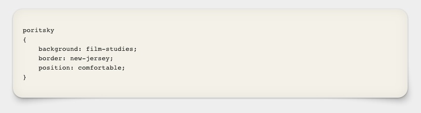
Oh, and that custom stylesheet I decided to work on the other day is featured in the image at the top of this article. You can go grab it here. Happy writing, if you ever get to it.
-
I tend to approach CSS with an idea in mind, challenging myself to get it done in no time flat and finding myself still tinkering hours later, hungry and disoriented. Doesn’t everyone? ↩︎
-
I’m looking at you, CSS Homer Simpson. ↩︎
Screenplay on a Galaxy Note
One thing I noticed during Sunday’s Oscars (which I rather liked) was the abundance of movie-themed commercials ABC aired. Either I recognize this every year and simply forget to remember or they aired them in stronger numbers this year. It’s an entertaining little thing, making commercials geared toward movie-lovers.
I noticed a new commercial for the Samsung Galaxy Note, the company’s 5.3 inch, er, crossover phone/tablet.1 It comes complete with a stylus, a marquis feature in Samsung’s book. Speaking as someone who mastered Graffiti on a Palm Pilot, it is my general experience that styli suck. They get lost, they’re imprecise and , more often than not, they give your hand cramps in the space of a minute or two.
Still, you’ve got to give it to Samsung for marketing their flagship 5.3 inch thingy-of-the-month as the device for the stylus crowd. They even gave the device a name that reflects a very paper and pen mentality: Note. This new ad pushes interesting uses for the stylus, including drawing messages over photos and adjusting a bar-graph.2
The first thing they show anyone using the stylus for, though, is marking up a screenplay. Here’s the still from about 22 seconds in:
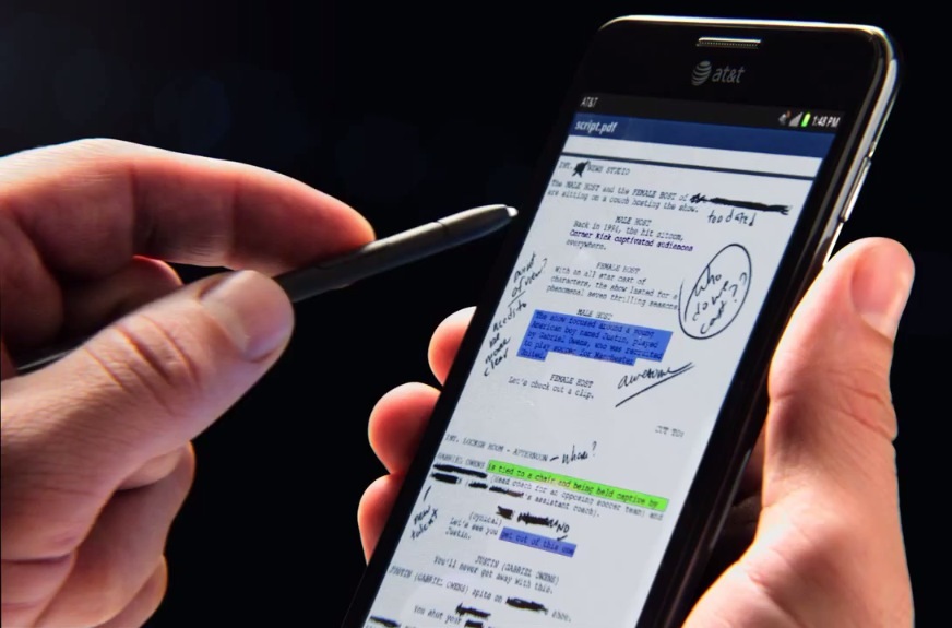
Samsung Galaxy Note Screenplay
The file is called “script.pdf” and we watch as our writer (or, more likely, reader) goes and highlights a character’s name in pink. This is the most compelling argument Samsung makes for a stylus. Stu Maschwitz recently laid out the biggest challenge to reading scripts on a tablet:
No one reads a printed screenplay without a pen in hand. So a tablet that allows “reading” a PDF isn’t enough to replace a hardcopy for the work of reading a screenplay. We need digital dog-ears.
Kudos to Samsung for presenting a real-world problem and solution in their commercial. The other use-case scenarios they present don’t make much sense.3 I have about a million questions to go along with the brief demo though, like how has the page been cropped, how do you turn pages, how do you change the highlight color of the stylus or make it into a pencil for annotation and does the apparently fine level of handwriting that appears on the screen happen at this zoom level or is it impossible to achieve that on the device in real-life?
I owned a Pogo stylus for a hot minute some time ago but found it to be a mostly useless addition to my iPad. A lot has changed since then (most apps now correct for your wrist touching the screen). The landscape of capacitive styli has grown with entrants like Studio Neat’s Cosmonaut and Wacom’s Bamboo Stylus; maybe I should reconsider my stance on whether or not they fit into my workflow.
Regardless, I’m curious what app is featured in the Galaxy Note commercial and what users are saying about it. If anyone knows, please share in the comments.
Wal-Mart to Give Hollywood a Hand ⇒
Wal-Mart is in discussions to provide an in-store service that will assist customers in registering DVDs they already own with the movie industry's UltraViolet system, according to several people familiar with the matter. [...] Employees of Wal-Mart will help customers create UltraViolet accounts, according to the people familiar with the plan. Wal-Mart staff will also check DVDs that shoppers already own, adding titles that are part of UltraViolet system to their accounts for a small fee, the people said. Wal-Mart is a member of the UltraViolet consortium.
Nothing sounds better than going to Wal-Mart to buy access to digital wares you’ve already purchased. Good luck with that.
(via The Verge.)
I Rather Liked the Oscars
Cynicism seems to be the prevailing theme among Oscar commentators the morning after the big event. The awards went to the wrong people, the ceremony was stale, Billy Crystal was too old and out of touch, etc. Yawn. What seems old and staid to me is this Monday morning bitching, the tropes of which haven’t changed since Crystal last donned tails and took the stage.
Overall I enjoyed the 84th Academy Awards show. I don’t begrudge Crystal for rehashing old bits, though I wish he could have breathed new life into some of them. The opening montage was able to eek out a few inspired edits (Moneyball’s baseball scouts as “young” writers), however it would have benefitted from a through-line plot better than “Should I host again?” Never mind that Crystal landed the gig on a technicality thanks to Brett Ratner’s big mouth, a fact never mentioned or mocked.1
The real crime of the show wasn’t creative, but technical. If anyone’s ears need rapping this morning it’s the sound crew. All night there was feedback from the microphones onstage, an annoying, echoed pitch that could be heard below everything. The stage mic even picked up Natalie Portman’s (admittedly misplaced) applauding fits as she presented the award for Best Actor. Worse, the sound was so horribly mixed that whenever there was music and speech at the same time, such as during Crystal’s medley or when the announcer shared facts about winners, dialogue was nearly inaudible. This is inexcusable. People can argue whether or not the show had any chops, but if you can’t hear the damn thing it doesn’t make a difference.
Part of what makes Billy Crystal such a great emcee is his ability to softly mock his targets, a fact that annoys his critics. They’d prefer he was edgier, but there is an art to what he does. Who else, for example, could have thrown so many potshots at Kodak without seeming like a jackass? Ricky Gervais has a similar talent for churlishness, but I couldn’t see him welcoming folks to the “Chapter 11 Theater” and getting a laugh.
As to the actual awards, I have no complaints. The critical community seems to have turned on The Artist as its reputation grew over these last few months, a phenomenon I’ll never understand. I keep hearing these excuses that it’s the easy choice; words like frothy and fluffy are being tossed about. Critics tend to concede that it’s good but only just so, an argument I can’t wrap my head around given how much crap is playing at theaters. Michel Hazanavicius is a master of cinematic impersonation, reviving styles of old with an impeccable attention to detail.2 The Artist is not a perfect film but it does what it does extremely well, and the world deserves more films from Michel Hazanavicius. You can bet we’ll get them now.
Hugo, the film which took home the second most awards, was my top pick of 2011. I am happy that such a richly nuanced film took home so many technical awards. The reason it topped my list last year is because it is the kind of film that moves us forward as a community, with Scorsese teaching us how to use the newest technologies in tandem with cinema’s oldest conventions. The major gamble that was Hugo (Scorsese? Kids? 3-D?) paid off in spades for the creative people who worked so hard to bring the vision of the film to life. Very well deserved.
All told, this year’s show was solid and reliable. The Academy’s attempts to skew the show younger have been half-assed failures in the past, not only because of their host choices but because of how frightened they are to break with tradition. Maybe they’ll get it right next year3, but in the meantime, I was only too happy to see Billy Crystal keep the stage warm.
-
Imagine the laugh if, in the opening sequence, Eddie Murphy made an appearance. ↩︎
-
If you argue that The Artist uses styles from the 1940s and 1950s even though it takes place in the 1930s, you deserve a kick in the head. ↩︎
-
If I had to pick a host, I’d lean towards Conan O’Brien. Not only does he have a decent track record with the Emmys, but he also has an undeniable respect for the medium of television and a reputation for turning the glitz and glam of Hollywood on its head. ↩︎
Music From & Inspired by Tiny Furniture ⇒
In 2010, I wrote and recorded the score for Lena Dunham's feature TINY FURNITURE. This release is the entire score, plus many other pieces I wrote for the film that didn't make the cut, including my cover of Sinead O'Connor's "Emperor's New Clothes," which was originally supposed to be the song over the end titles (we couldn't afford the rights), and "When You Come Home," my duet with Rebecca Schiffman that ended up being at the end instead.
$5 cheap.
{::nomarkdown}
{:/nomarkdown}Simple Explanation of Digital ISO ⇒
{::nomarkdown}
{:/nomarkdown}I have always found core photographic concepts difficult to understand in the digital realm. Buying different film stocks, for example, has always made more sense to me than committing to a single digital sensor. This video by Dylan Bennett does a great job of explaining digital for digital’s sake, that is without the context of legacy film analogies.
Clear, concise and useful. I just learned a lot about what actually happens when I boost my camera’s ISO.
(via Justin Blanton.)